


CLIENT
Society Of Salad
SERVICES
Rebranding
YEAR
2024
ONE STEP TOWARDS CONSCIOUS EATING!
A vibrant, clean-eating space that not only makes your dining nutritious but also exciting, accessible and fun leaving you feeling warm and energetic. It’s a community where every meal celebrates flavour, conscious eating, and joyful living.
When the DS Group approached us to refresh their existing cafe brand UnCafe, our first instinct was clear:
the transformation had to go beyond a visual update, it needed a new name, a new purpose, and a new soul. The existing name didn’t reflect the energy, freshness, or clarity that a conscious eating space demands. We set out to build something vibrant, inclusive, and full of flavour, much like the food it would serve. That’s how Society of Salad was born.
The earlier name, UNCAFE, felt ambiguous, neither clearly communicating its food philosophy nor sparking curiosity. With growing demand for healthy, conscious food spaces that are exciting and accessible, the brand needed:

01
A clearer identity and positioning
03
A design system that echoed vitality, freshness, and inclusivity
The rebrand was an opportunity to reposition the space as a joyful, flavour-forward celebration of clean eating- a Society where everyone belongs.
02
A name that celebrated what it stood for
04
A voice that could rally a community, not just sell a salad
Naming
For the name we wanted something that instantly reminded one of what this space offered and why this space existed. We wanted a name that was inclusive, fun and energetic. A name that felt like a community coming together. And that’s when it hit us, a ‘society’, where people from different walks of life and passion that share the same interests come-together in harmony, a space that is not limited.
Coining the name ‘Society of Salad’
One community, one passion, one motive- where everyone celebrates clean eating.
“Society” brings warmth, community, and inclusivity.
“Salad” roots it in nourishment, customisation, and freshness.


+


=

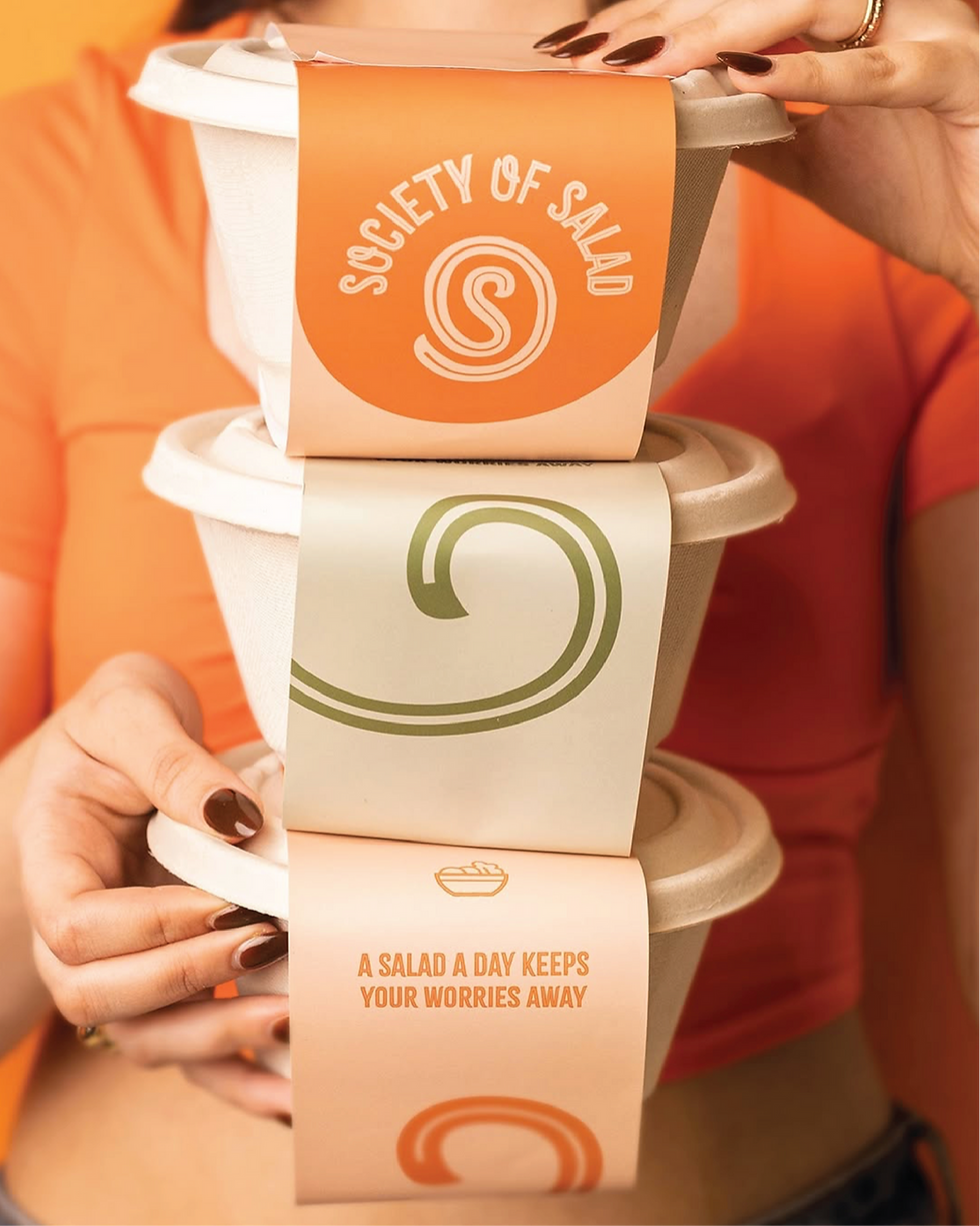
The branding was crafted to feel fresh, friendly, and full of personality - just like the food it represents. We chose Citrus Gothic Inline for the logotype because of its rugged and fresh energy; it’s bold yet breezy, capturing a sense of originality and joy.


Every detail in the typography holds meaning: leafy flourishes in the ‘S’ and ‘A’ aren’t just decorative, they
symbolise nature, life, and growth. Slightly modified curves add a playful character, while all-caps headlines lend clarity and structure.
Typography
We chose Citrus Gothic Inline for headlines and the logotype because of its rugged and fresh energy; it’s bold yet breezy, capturing a sense of originality and joy. Paired with Brinnan, a clean, modern typeface used in both bold and regular weights for body copy, we strike a thoughtful balance between design-forward aesthetics and everyday legibility.
Citrus Gothic Inline
A B C D E F G H I J K L M N O P Q R S T U V W X Y Z
BRINNAN
Aa Bb Cc Dd Ee Ff Gg Hh Ii Jj Kk Ll Mm Nn Oo Pp Qq Rs Ss Tt Uu Vv Ww Xx Yy Zz
Colour Palette
Colour choices were equally intentional. A grounding cream anchors the palette, while orange brings appetite, joy, and warmth. Light and dark greens evoke freshness and health; yellow infuses cheer; and purple, used sparingly, adds contrast and a hint of quirk. Together, the colours feel earthy, energetic, and fun as if mirroring the spirit of the brand and the people it brings together.


Iconography

Packaging


Space Branding


Social Media
Welcome to the freshest club in the town
Welcome to the freshest club in the town


