CLIENT
AVOKADO
SERVICES
Visual Identity, Animations, Social Media Launch
YEAR
2023
A SERENE SPACE NESTLED AMONGST CHAOS
Avokado is a boho-style cafe that offers a warm, welcoming atmosphere. Serving a variety of wholesome dishes. Started with a simple idea of becoming ‘the go-to place’ for all hunger shenanigans, offering delightful dishes in a space surrounded by bars, Avokado became just that! Our vision for this project was to create a brand that isn't afraid to have a good time and takes having fun seriously.
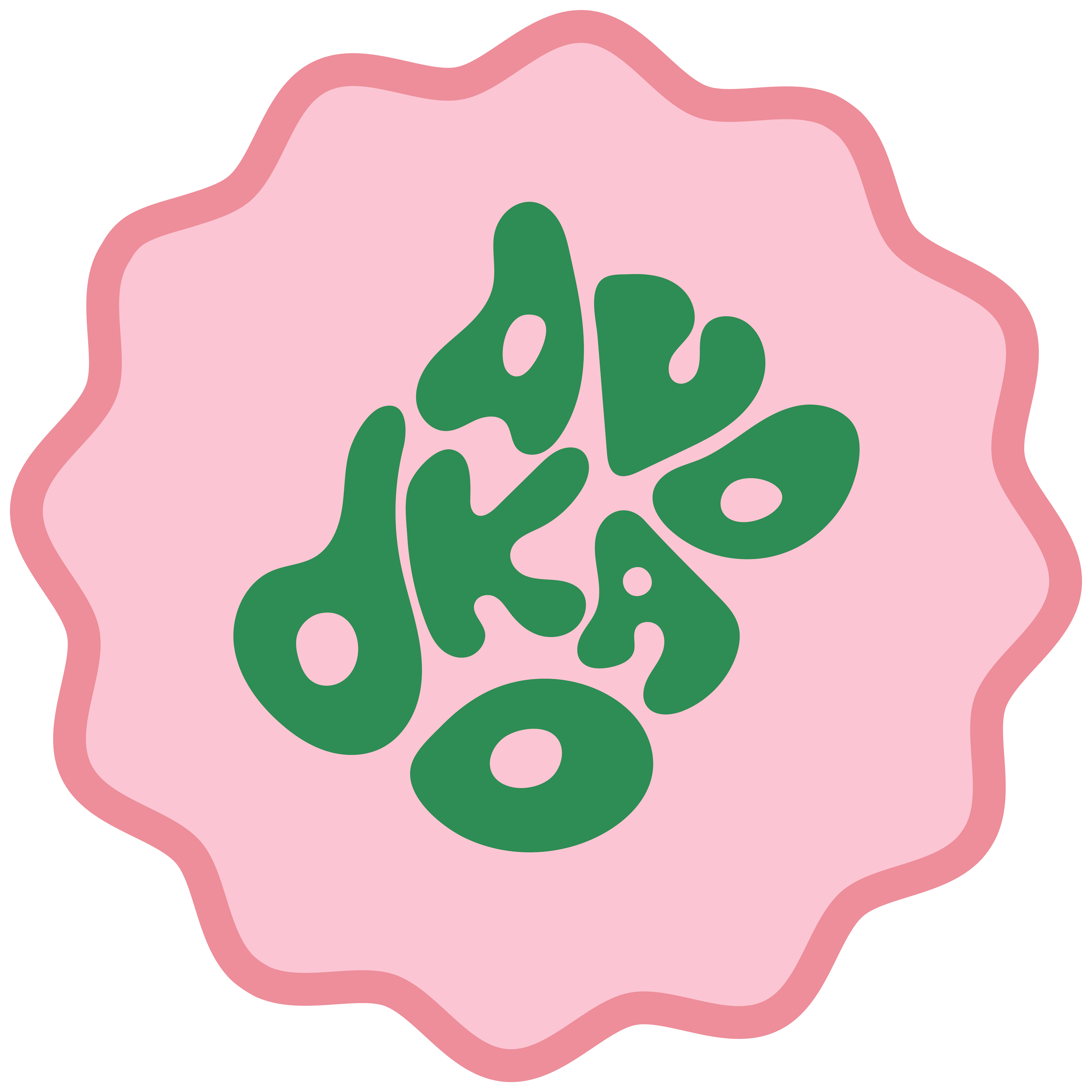
We drew inspiration from the concept of a hearty breakfast and the playful nature of avocados. The idea of the logo 'deforming' like jam on toast symbolises the brand's ability to adapt and spread joy.


.jpg)


.jpg)


Sunny


Avocado

Organic

Fruity
Young
The design encapsulates the warmth, vibrancy, and playful spirit of Avokado, inviting customers into a cozy yet lively atmosphere. The unconventional and engaging nature of the logo challenges viewers to look closely, reinforcing the brand's commitment to providing an unforgettable dining experience that is both fun and inviting.


Bright & Warm :
The choice of bright colours reflects the vibrancy and energy associated with Avokado's atmosphere. These hues convey a sense of warmth, inviting everyone to relax and enjoy their dining experience in a cozy environment.
Full of Sunshine :
Just as sunshine brightens up a day, these colours create a positive and welcoming atmosphere, enhancing the overall dining experience for customers.
Duotone Colour Scheme :
The duotone colour scheme offers a modern twist to the branding, combining two complementary shades to create depth and visual interest. This choice adds sophistication to the brand while maintaining a playful and approachable vibe.
Colours
We wanted a cohesive colour palette that not only mirrored Avokado’s ethos but also created a contrast to its bohemian, serene space. The idea behind the colour scheme came from the fun, transformative nature of the logo. The colours also evoke a sense of brightness, warmth, and tanginess.
Playful Tone :
The language used is conversational, injecting humor and wit into interactions with customers.
Quirky Brand Voice :
Whether through witty puns, playful wordplay, or clever taglines, the brand voice stands out as distinctive and memorable.
Visual Playfulness :
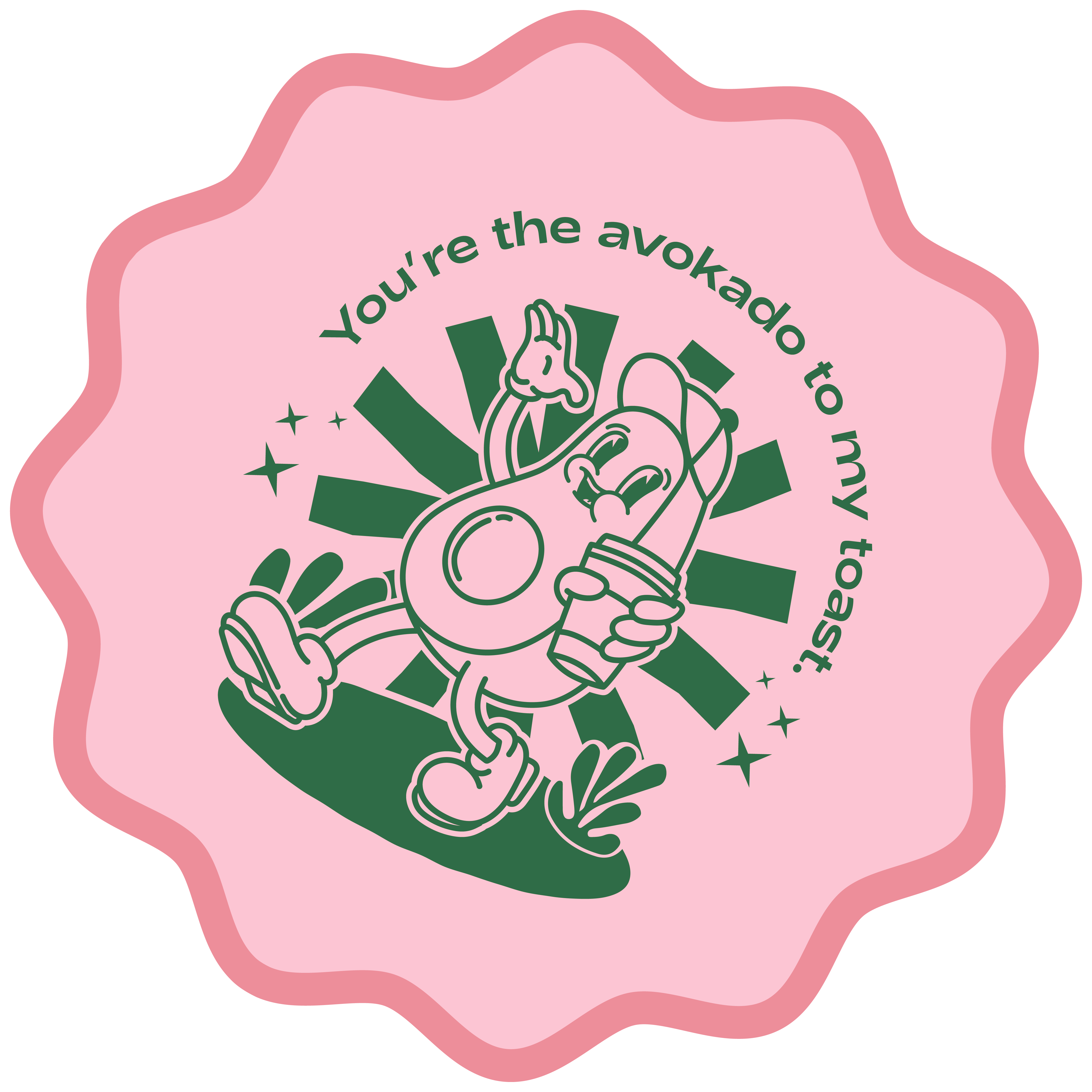
From whimsical illustrations to quirky graphics, every visual aspect of the brand reinforces its playful and friendly persona.
Communication:
Fun, Quirky, and Friendly
We designed a communication style that reflected the cafe's vibrant and welcoming atmosphere. Communication is warm and approachable, fostering a sense of camaraderie and connection between the cafe and customers.


HEX: F15A29
RGB: 241 90 41
HEX: FACED5
RGB: 250 206 213

HEX: 0D775A
RGB: 13 119 90


